Alter

Kosmedix​

Branding, Packaging​

Client

Kosmedix

Year

2023

Kosmedix is a modern unisex wellness brand that embodies confidence, boldness, and self-care. Its branding features a clean sans-serif logotype and a distinct turquoise palette, reflecting vitality and balance. The design system ensures a cohesive presence across packaging, social media, and advertising, making Kosmedix a standout brand that celebrates self-love and holistic well-being for all.

Kosmedix is a modern unisex wellness brand that embodies confidence, boldness, and self-care. Its branding features a clean sans-serif logotype and a distinct turquoise palette, reflecting vitality and balance. The design system ensures a cohesive presence across packaging, social media, and advertising, making Kosmedix a standout brand that celebrates self-love and holistic well-being for all.

Kosmedix Behance 01
Kosmedix Behance 02

THE CHALLENGE

To craft a visual identity that projected Kosmedix as a ‘Bold, Sharp, Friendly And Timeless’ brand. Kosmedix came to us with the desire to revamp its brand identity. The goal was to create a complete brand identity system for Kosmedix that captured the essence of the brand. The key element here was the logo — the most important visual asset of the brand, embodying resourcefulness and simplicity, projecting a ‘Bold, Sharp, Friendly And Timeless’ brand. We had to craft the logo and the brand identity system as a representation of their end-to-end aesthetic care solutions for women and men. The intention was to:
  • Maintain authenticity and build brand equity;
  • Leverage the scale of their system across all mediums;
  • Provide more consistency and quality; and
  • Facilitate increased system productivity
  • Kosmedix Behance 03

    THE ALT-ER SOLUTION

    As with any project, the process started off with sketching. Rough concepts that came to mind were documented, both on paper and digitally. After a lot of exploration on messy artboards in Adobe Illustrator, a few selected variants were presented to the team. Upon their feedback and a couple more revisions, a strong and refined concept was proposed. This made the cut and is now the current logo.
    Kosmedix Behance 4
    Kosmedix Behance 05

    THE IDENTITY SYSTEM

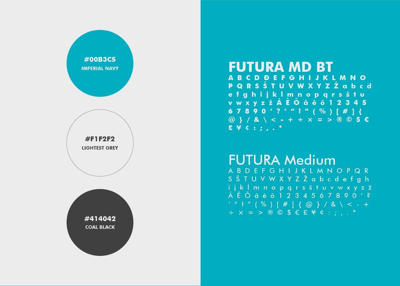
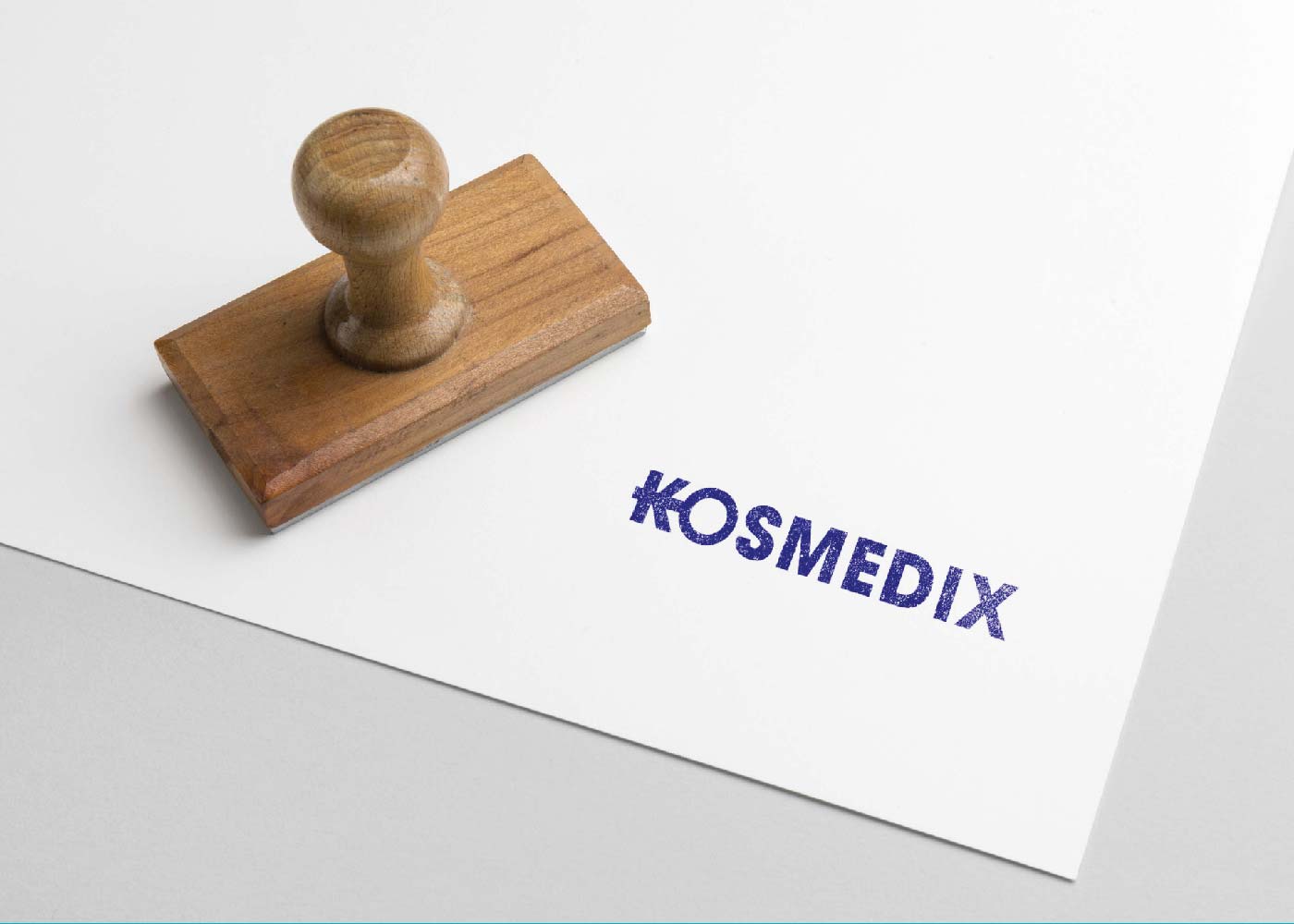
    The font and colour theory plays a big part in capturing the spirit of the brand. A serif font, having an authentic quality that ties in with Timeless and Boldness values, proved to be the way to go for the logotype. It expresses trust and reliability, attention to detail and personable service – all of the company’s core values & qualities.
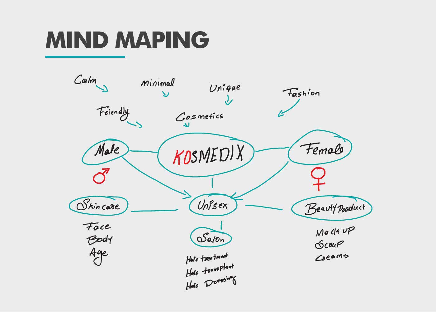
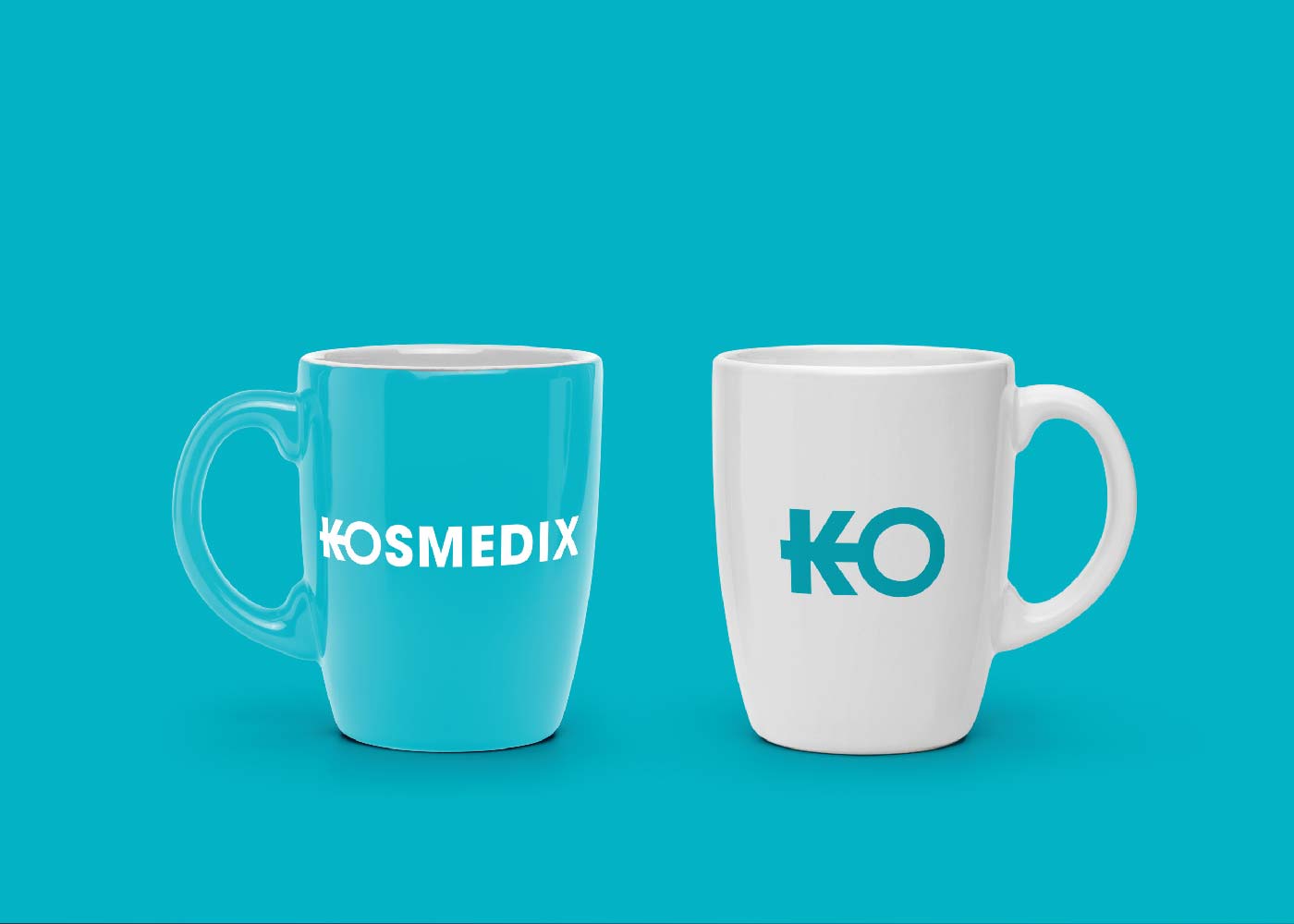
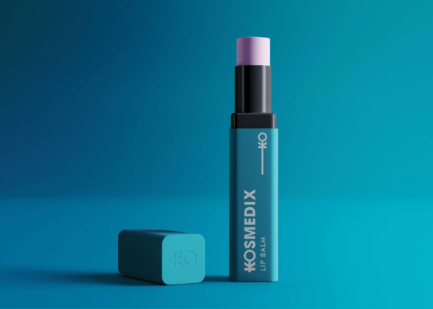
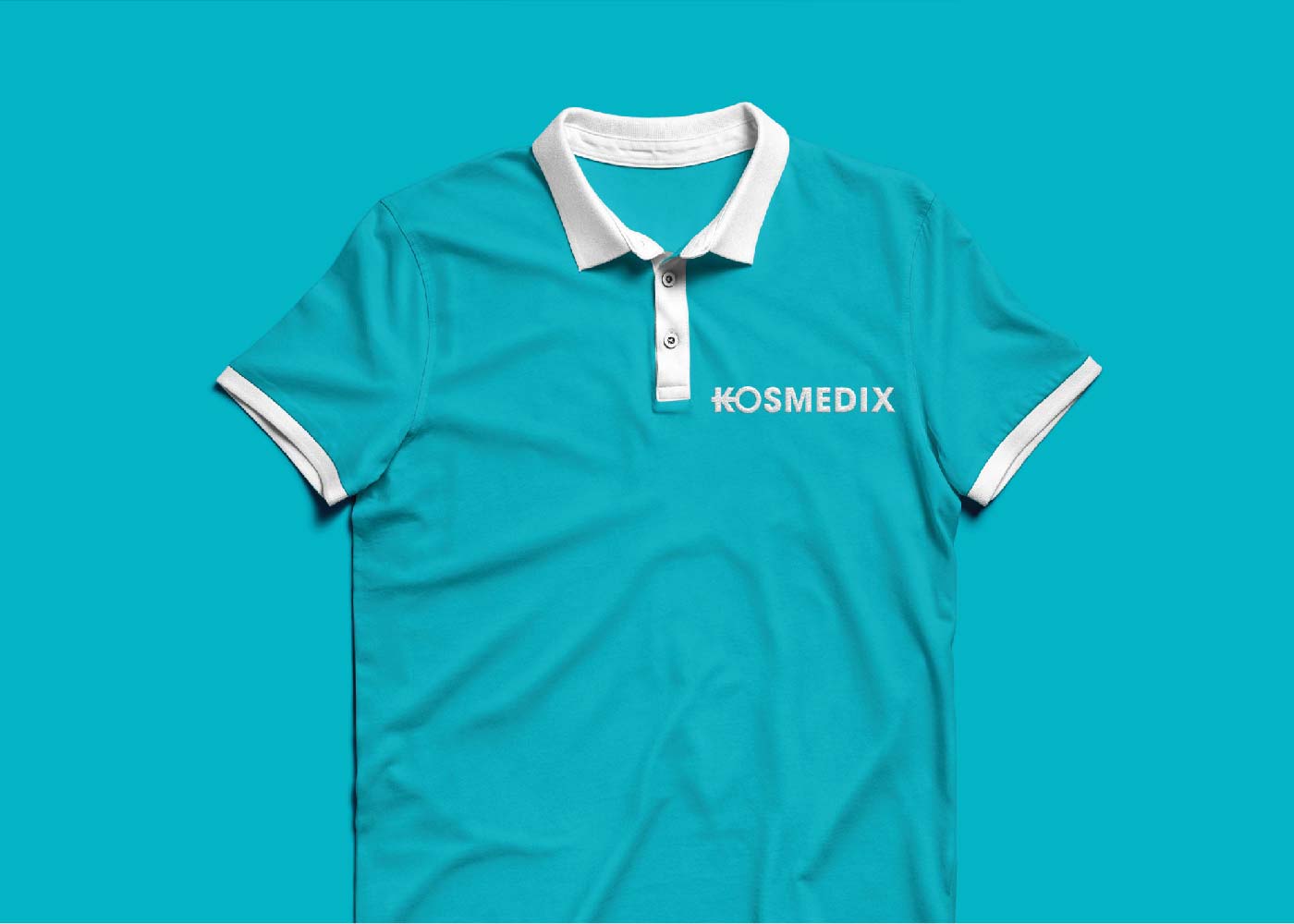
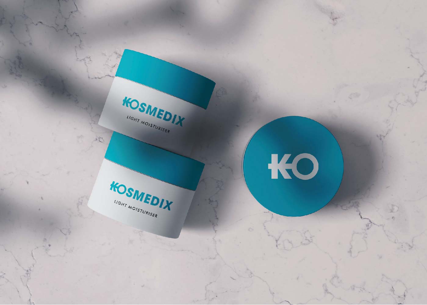
    The Kosmedix brand identity is born from the brand idea of feeling confident, boldness and pays homage to people who are driven by self-love. All the graphic elements and the overall graphic language is a reflection of this.
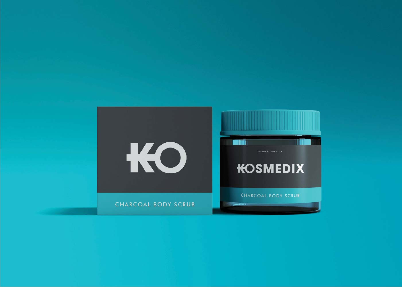
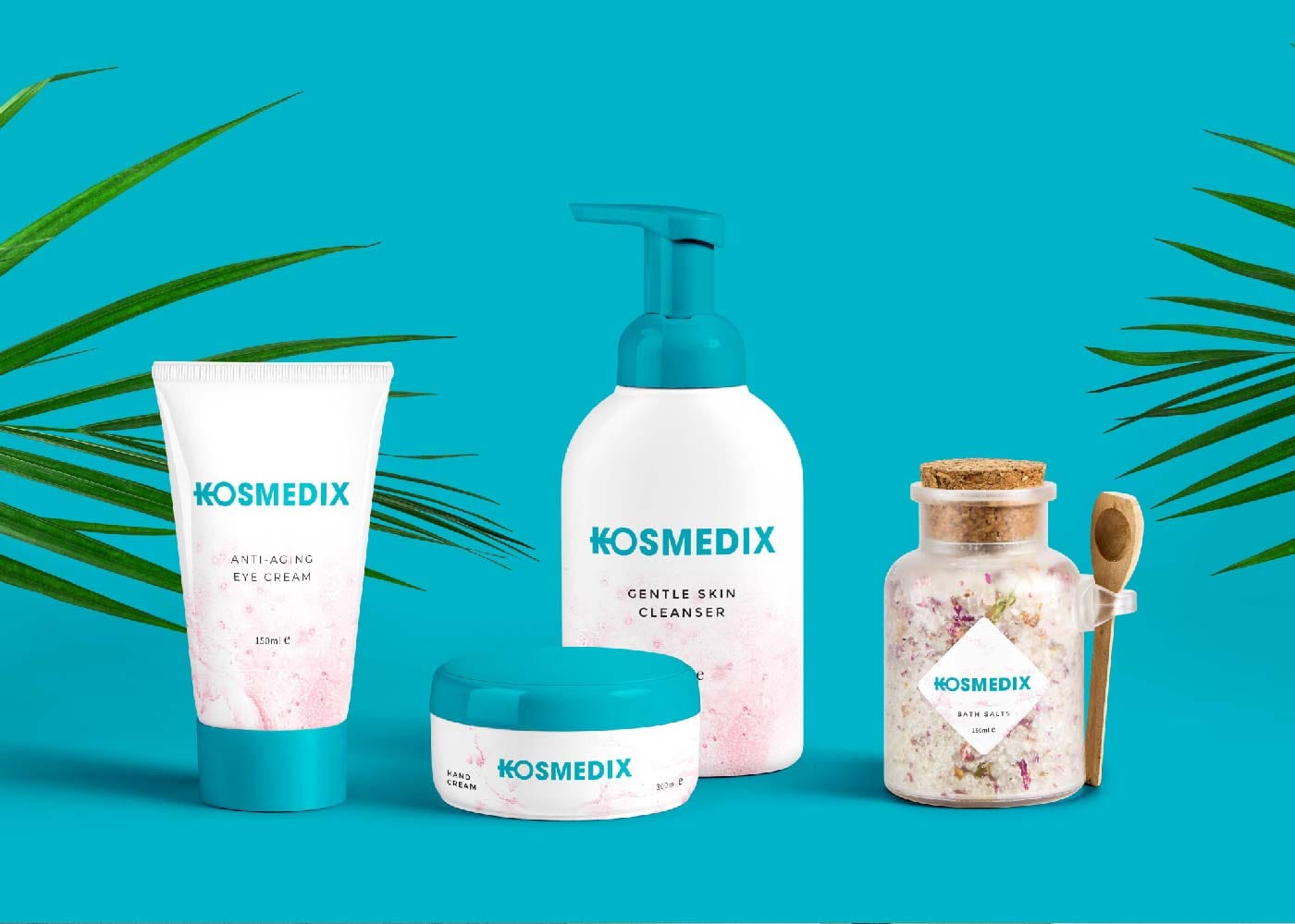
    Kosmedix is a single coloured brand. It makes them stand out and plays a critical part in what makes them look and feel different. White and Light Gray are usually used for backgrounds. Coal Black is usually used for body text.
    Kosmedix Behance 06 min
    Kosmedix Behance 08
    Kosmedix Behance 07 min
    Kosmedix Behance 09
    Kosmedix Behance 10
    Kosmedix Behance 11
    Kosmedix Behance 12
    Kosmedix Behance 13
    Kosmedix Behance 14
    Kosmedix Behance 15 1