Type or ‘Typography’ is an important part of the design used on a day to day basis. We see type everywhere. It’s a daily part of our lives. It is used in every part of graphics and advertising. It is utilized to characterize text. Through typography, the body of the text can reveal the mood of a given design and convey a message.
We now stay connected to the digital medium for the typefaces. The type has existed for more than 15 centuries. Calligraphers used to hand-drawn and over time it has evolved. And based on this we have classified them into categories and we use them based on scenarios or the type of language we want to show the audience.
Different types of typography
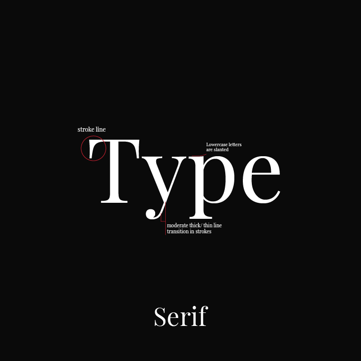
Serif
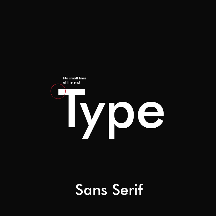
Sans serif
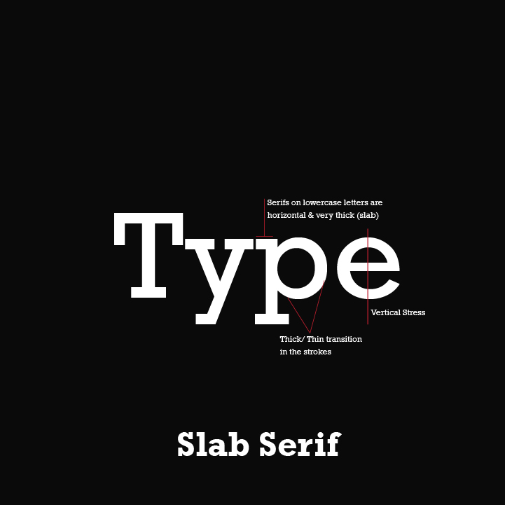
Slab serif
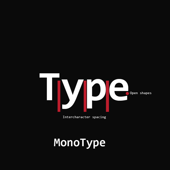
Monotype
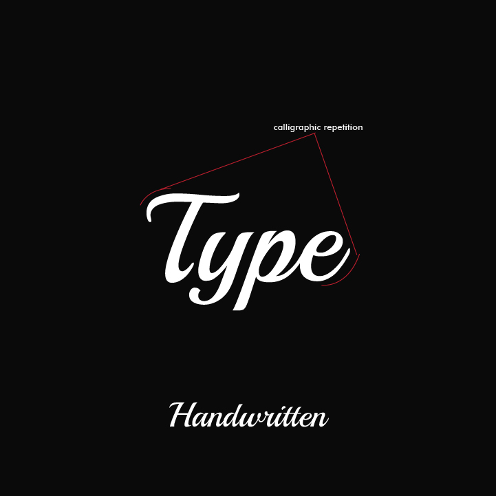
Handwritten
Serif
It is a small line or stroke attached to a larger stroke in a letter or symbol in a particular font type.
Sans serif
A typeface without strokes is called sans serif. Sans is a French word that means without.
Slab serif
A typeface with a heavy stroke weight is called slab serif. They are minimal or don’t have any bracketing.
Monotype
A typeface where all the characters have the same width.
Handwritten
A typeface that is unconventional with a natural handwritten.
Elements of Typography
Font Selection
There is a vast selection of typefaces for you to choose from. Typefaces come with various weight sizes and styles to form a family considering the kerning types and multi-language support.
While there is a wide range of fonts available, choosing the fonts includes all the options you need to make a great design.
SIZE
Not all the fonts you select are of the same size or with a fixed width. So words set in different typefaces can take up very different amounts of space on the page. The most common method to measure type is the point system. One point is 1/72 inch. 12 points make one pica. They can also be measured in inches, pixels, and millimeters.
Hierarchy
If all the type in your design looks the same, the information which has to be communicated will be confusing. Size is the most common way to create a hierarchy to communicate and guide readers. Headings are in a larger point size subheadings are small and body text is still smaller. Size is not the only way to define a hierarchy- it can also be achieved with color, spacing, and weight.
The type itself has many other basic requirements we look upon. As we need the design to be visually presentable and concentrating on the overall look and feel. Typography plays a major role in how your brand is perceived by your audience. Thus making it an important factor in graphic design. With the help of Alter- Branding and Design Agency, take your typography to the next level.